Data Visualization for Businesses: Unlocking Business Intelligence and Insights
 Mark Petrenko
 Defining Data Visualization
In the Digital Age, our ability to understand and communicate through visual storytelling stands paramount. Data Visualization isn't just about pretty graphics; it's the art and science of turning abstract data into comprehensible images, charts, or graphs. This transformation provides an immediate view of complex ideas, making data accessible to both analytical minds and the general populace. It equips businesses with the tools to turn vast volumes of seemingly unintelligible numbers into actionable insights.
Data Visualization in the Context of Business Intelligence
Business Intelligence (BI) has revolutionized how organizations function, facilitating a data-centric approach to decision-making. Using advanced BI platforms, businesses can extrapolate data literacy and visualization to identify critical business trends. These platforms not only streamline vast data sources but also illuminate patterns, anomalies, and relationships. This spotlight on data empowers organizations to be proactive, preemptively addressing potential issues and seizing opportunities.
Data-Driven Decisions: A Contemporary Business Imperative
In a landscape that's evolving every second, agility is a business's best ally. With the enormous volumes of data generated daily, manually sifting through is next to impossible. Data visualization simplifies this mountain of information. It presents data in a manner that’s quickly digestible, ensuring companies aren't just reactive but can foresee and shape future scenarios. As data-driven decisions become an unwavering standard, ensuring that these decisions are based on accurate, easily digestible data is non-negotiable for success.
Tools and Technologies Powering Data Visualization
Overview of Popular Data Visualization Tools
The market is teeming with visualization software, each tailored to specific needs and nuances. Whether you're a small business looking for basic charting tools or a multinational conglomerate in need of intricate dashboard design, there's a tool out there for you. Some popular names cater to wide-ranging business needs, while niche tools cater to specific sectors, offering specialized visuals and metrics.
The Rise of Real-time Data Visualization Platforms
Time is of the essence, and businesses can't afford to base decisions on yesterday's data. Dynamic visualization platforms are meeting this need. These systems provide a pulse on operations, updating metrics instantly. Whether it's monitoring website traffic, sales, or supply chain disruptions, real-time insights can be the difference between capitalizing on an opportunity and missing the bus.
The Importance of Interactivity: Exploring Interactive Charts
Static charts belong in the past. Today's businesses demand interactive charts that allow decision-makers to delve deeper, adjust parameters, and explore various scenarios. This hands-on approach to data exploration enhances understanding and offers insights that might remain buried in static visuals. From user interfaces that allow drag-and-drop functionalities to charts that morph with a click, interactivity is redefining the data visualization landscape.
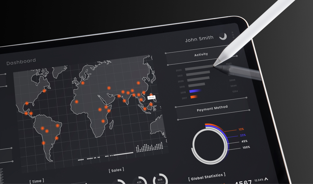
Constructing an Effective Business Data Dashboard
What Makes a Dashboard Effective?
An efficient dashboard is more than just a collection of visuals. It’s a cohesive unit that, with the right balance of design principles, effectively communicates insights. It employs a visual hierarchy ensuring that the most vital metrics capture attention. Elements such as color, size, and position are strategically used to guide viewers, ensuring they get the complete story without feeling overwhelmed.
KPI Visualization: Translating Metrics into Visuals
Every business revolves around Key Performance Indicators (KPIs). They provide a pulse on performance, highlighting successes and flagging areas of concern. By leveraging analytic models, businesses can transform these KPIs from mundane metrics into dynamic visuals. These visuals not only make meetings more engaging but ensure that stakeholders, regardless of their data literacy, walk away with a clear picture.
Dynamic Data Representation Techniques
In today's tech-savvy world, data isn’t just about bar charts or pie diagrams. Techniques like 3D visualization and virtual reality (VR) visualization elevate data presentation. They turn static numbers into interactive experiences, enabling users to engage with data on a whole new level. Whether it's a 3D representation of sales across a region or a VR walkthrough of website traffic flow, dynamic representation is the future.
Visual Analytics: The Advanced Frontier
Distinguishing Between Visual Analytics and Traditional Data Analysis
While traditional data analysis focuses on examining raw data to draw conclusions, visual analytics elevates this process by integrating data analysis and visualization. It emphasizes not just the "what" but the "why" behind data. This approach enables businesses to recognize visual patterns, transforming raw data into a compelling narrative that can be intuitively understood and acted upon. It's not just about observing; it's about engaging and interrogating the data, allowing for deeper insights and sharper decision-making.
Real-World Applications and Case Studies
From healthcare to retail, visual analytics is reshaping industries. Retailers, for instance, use analytic models to track customer behavior, visualizing this data to optimize store layouts or online shopping experiences. Healthcare providers, on the other hand, harness the power of visual analytics to predict outbreaks or optimize patient care paths. Through these real-world applications, the impact of marrying analysis with visualization becomes palpably evident.
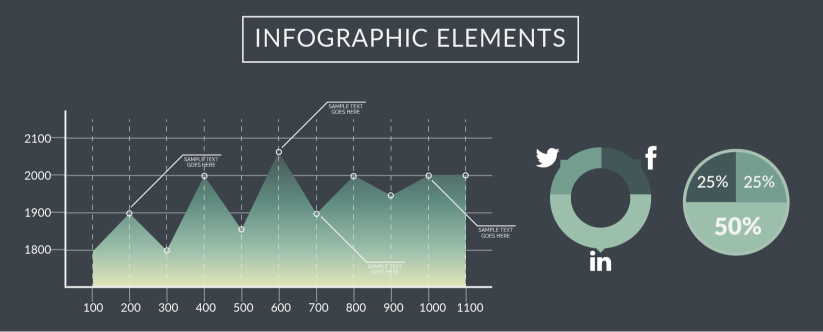
The Role of Infographics in Simplifying Data Presentation
Infographics have surged in popularity, and it's not hard to see why. They distill complex data into easily digestible, often entertaining visuals. But they're not just for social media or marketing. Businesses use infographics internally to communicate annual reports, training materials, or to break down intricate processes. A well-designed infographic captures attention and communicates its message quickly, capitalizing on our brain's innate attraction to visuals.

Best Practices and Principles in Data Visualization
Foundational Principles of Data Representation
There's an art and science to data visualization. Adhering to foundational principles ensures that the message is clear, and the data is not misrepresented. This encompasses concepts like maintaining a balance between clarity and precision, understanding and leveraging visual cues, and ensuring that the viewer's attention is strategically guided using effective visual hierarchy.
Ensuring Accurate Data Interpretation
It's not just about presenting data, but ensuring it's interpreted correctly. Misleading visuals can lead to disastrous decisions. Ensuring accuracy involves selecting the right type of chart for your data, providing context, and avoiding visual clutter. Remember, a simpler, cleaner design often communicates more effectively than a complex one.
Color, Layout, and Design: The Unsung Heroes of Effective Visualization
Much like in any design field, these elements play a pivotal role. The right color palette can emphasize trends, differentiate data sets, and guide the viewer's eye. The layout ensures the logical flow of information, while thoughtful design ensures the data's story is front and center, enhancing the user experience.
The Tangible Benefits of Data Visualization in Business
Making Complex Data Accessible and Understandable
For many, a table of numbers can be daunting. Visualization turns this raw data into a story, making it not just accessible, but engaging. By breaking down complexities, businesses can align their teams, ensuring everyone, from tech wizards to novices, is on the same page.
Gaining Rapid Business Insights for Strategic Advantages
Speed is the essence of business. With data visualization, businesses can swiftly spot trends, challenges, and opportunities. This ability to glean rapid insights means they can pivot faster, seizing competitive advantages and navigating challenges more effectively.
Data Visualization’s Role in Predictive Analytics and Forecasting
Predicting the future is a superpower that data visualization offers. By analyzing past and present data, businesses can forecast trends, making informed predictions about market movements, customer behaviors, or potential risks. This predictive analysis capability ensures businesses are always one step ahead.

The Road Ahead: Future Trends in Data Visualization
Challenges and Opportunities in Modern Data Visualization
With the boon of Big Data, one challenge is sifting through the noise to find valuable insights. Issues like data ethics, ensuring data privacy and integrity, will also take center stage. However, with challenges come opportunities. The integration of augmented analytics, where AI assists in data analysis, will revolutionize how businesses interact with their data.
The Integration of AI and Machine Learning in Visualization Tools
Automation, driven by AI and Machine Learning, is set to redefine visualization. Tools will not just display data but predict what visuals a user might need next, customize dashboards in real-time, and offer insights proactively. From 3D visualization to virtual reality (VR) visualization, AI will make these tools more immersive and intuitive.
Preparing Businesses for the Next Wave of Visualization Innovations
It's not just about the tools but about preparing businesses culturally and structurally for what's next. Training teams, investing in the right infrastructure, and fostering a culture of curiosity will be key. As innovations like VR visualization become mainstream, businesses need to be ready to harness their potential fully.
Conclusion
In today's data-driven world, visualizing information isn't just a luxury—it's a necessity. As businesses continue to grapple with increasing volumes of data, the way this data is presented can spell the difference between insight and confusion, between a strategic leap and a misguided step. Data visualization offers businesses a unique lens to view, analyze, and interpret data, weaving complex numbers into compelling narratives that drive decision-making. With advancements in AI, VR, and other technologies, the horizon of what's possible in this field continues to expand. Embracing these tools and practices isn't just about keeping up with the competition—it's about envisioning a future where data isn't just understood, but where it's experienced in ways we're only beginning to imagine.
References
- Few, S. (2012). Show Me the Numbers: Designing Tables and Graphs to Enlighten. Analytics Press.
- Tufte, E.R. (2001). The Visual Display of Quantitative Information. Graphics Press LLC.
- Knaflic, C.N. (2015). Storytelling with Data: A Data Visualization Guide for Business Professionals. Wiley.

