How to Create Engaging Infographics: A Comprehensive Guide
 Mark Petrenko
 Have you ever scrolled past an eye-catching visual online, only to be drawn back by its vibrant colors and engaging presentation of information? The irresistible pull that made you stop and click? That's the magic of infographics. These data-driven visual narratives are changing the way we consume information, making even the most complex data digestible and engaging.
Importance of Infographics in Presenting Data
Infographics are powerful tools in presenting data. Our brains are naturally inclined to interpret visual information far more efficiently than text or numbers alone. Infographics leverage this strength by transforming data into visual representations, making complex information easy to understand at a glance. This transformation into visually appealing graphics is all about information design. It's an art form that blends graphic design and data in a way that's not just digestible but also intriguing.
The Power of Visual Storytelling in Engaging Content
But what makes infographics truly unique is their storytelling capabilities. A good story captivates the audience, immerses them in the narrative, and keeps them engaged. The same principle applies to infographics. By weaving data into a compelling narrative, infographics bring a storytelling aspect to data visualization, making the content more engaging and memorable.

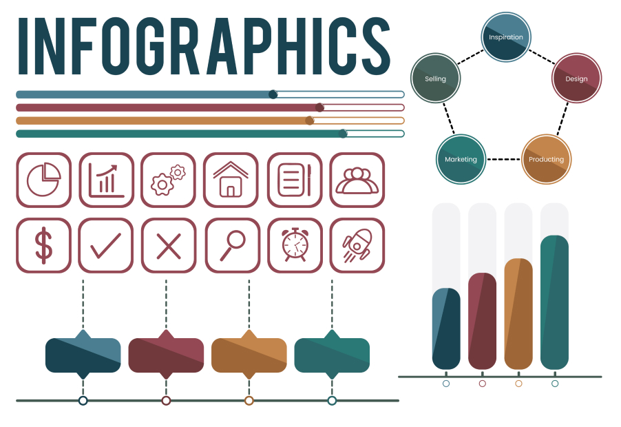
Understanding the Basics of Infographics
What are Infographics?
Infographics, a blend of "information" and "graphics", are visual representations that simplify complex data, concepts, or processes. Picture them as visual interpreters - they step in to translate and decode the intricate world of data and facts into something the average person can easily understand and remember.
Role of Infographics in Data Visualization
Infographics are the workhorse of data visualization. They transform raw, unprocessed data into a visual story that resonates with the viewer. By creating a visually compelling narrative of visual data, infographics form a connection between the intricate world of data and our visual-centric brains. They speak the language of images and colors, and in doing so, they narrate the story hidden in the depths of data.
Design Principles for Creating Effective Infographics
Importance of Layout Design
An engaging infographic is a harmonious blend of aesthetics and readability, and the layout design is the backbone of this harmony. The layout design orchestrates the flow of information, guiding the viewer's eyes across the infographic in a way that makes sense. It's all about creating a visual hierarchy, ensuring the most important information catches the viewer's attention first. It's like the director of a play, guiding the actors on when to enter the stage and when to exit, creating a seamless performance that leaves the audience awestruck.
Utilizing Visual Elements for Greater Impact
Visual elements, such as colors, typography, and icons, are the stars of your infographic show. They are the elements that capture attention, invoke emotions, and ultimately drive engagement. By understanding the principles of color theory, typography, and iconography, you can manipulate these elements to add depth and personality to your infographic. It's the graphic design equivalent of adding spices to your dish - they enhance the flavor and leave a lasting impression.

Steps to Create Engaging Infographics
Data Collection: The Foundation of Infographics
Data collection is your first step in creating an engaging infographic. Think about what information your audience needs to know, and then start the hunt for this data. Use reliable and accurate sources such as government databases, research papers, or reputable news outlets. Make sure your information is up-to-date and relevant. After all, an infographic built on weak or inaccurate data will lose its credibility.
Crafting a Narrative: The Art of Storytelling in Infographics
The most memorable infographics tell a story. Now that you have your data, it's time to find the narrative within. What message are you trying to convey? What is the most logical way to guide your audience through the data? Start with a clear and concise headline, then plot your main points, and ensure your information is organized logically to tell a compelling story.
Choosing the Right Charts and Graphs
Now it's time to visualize your data. The types of charts and graphs you select will depend on the nature of your data and the story you're telling. Bar charts are excellent for comparing categories, line graphs are perfect for showing trends over time, and pie charts work well for showing proportions. Make sure the style of visualization you choose helps to enhance understanding and doesn't confuse or mislead your audience.
Designing the Infographic Layout
Design is not just about making your infographic look pretty. A good design helps guide your audience through the information. Use a layout that logically and clearly presents your information. Start with an engaging header, then lead your audience through your narrative with a flow that's easy to follow. Use space wisely - don't clutter your design. Break up your information with different sized text, colors, and images to create visual hierarchy and guide the viewer's eye through the data story.
Tools for Creating Infographics
Fortunately, creating stunning infographics doesn't require a degree in graphic design. There are numerous tools available that can help you bring your vision to life.
Overview of Popular Infographic Tools
These tools range from simple drag-and-drop editors like Canva and Piktochart to more advanced design software like Adobe Illustrator. Each tool offers its unique set of features and capabilities, so it's important to find one that aligns with your needs and skills.
Choosing the Right Tool for Your Infographic
The choice of tool can significantly impact the ease and efficiency of the infographic creation process. When selecting a tool, consider factors like your budget, the features you need, the learning curve associated with the tool, and the level of flexibility and control you want over your design. It's about finding the right balance between usability and functionality that suits your specific requirements.

Tips for Making Your Infographic More Engaging
Using Design Principles to Enhance Readability
Design principles are the secret sauce that can take your infographic from good to great. By applying principles like contrast, alignment, repetition, and proximity, you can enhance the readability of your infographic. For instance, using different font sizes and colors can help highlight key points, making them stand out and catch the viewer's attention.
Integrating Engaging Content into Your Infographic
Engaging content goes beyond just presenting facts and figures. It's about creating a narrative that resonates with the viewer, sparks curiosity, and encourages them to explore further. Every element in your infographic, from the data and visuals to the colors and typography, should be geared towards capturing the viewer's interest and keeping them engaged.
Conclusion
Recap of the Importance and Process of Creating Engaging Infographics
We've come a long way from where we started, haven't we? We've dived into the importance of infographics in presenting data, explored the power of visual storytelling in creating engaging content, unraveled the design principles that drive effective infographics, and walked through the step-by-step process of creating your own infographic.
Encouraging Further Exploration and Creativity
But remember, this is just the beginning. The world of infographics is vast and brimming with creative potential. So why stop here? Take what you've learned and push the boundaries. Experiment with different formats, play with new design principles, and don't be afraid to make mistakes. Because in creativity, every mistake is just another step towards mastery.
References
- "The Wall Street Journal Guide to Information Graphics: The Dos and Don'ts of Presenting Data, Facts, and Figures" by Dona M. Wong: This book provides invaluable tips on how to present data in the clearest and most effective way.
- "Infographics: The Power of Visual Storytelling" by Jason Lankow, Josh Ritchie, and Ross Crooks: Learn more about the art of visual storytelling in this comprehensive guide.
- Coursera – “Information Visualization: Foundations”: An online course that provides the foundations of making effective infographics.
- Edward Tufte’s books and workshops: Edward Tufte is a pioneer in the field of data visualization, and his books and workshops are comprehensive resources on the topic.
- FlowingData: A website that explores how designers, statisticians, and computer scientists are using data to understand ourselves better.

