The Rise of Responsive Web Design
 Mark Petrenko
 Definition of Responsive Web Design
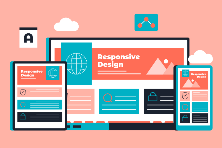
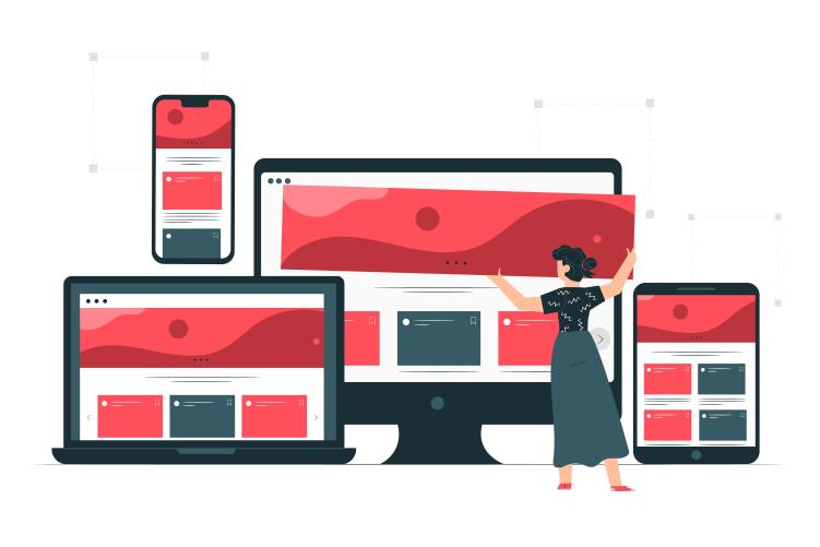
Responsive Web Design, often referred to as RWD, is a progressive approach to web design that ensures websites look and function effectively on different devices, irrespective of screen size or resolution. The idea behind RWD is to ensure that content, images, and overall structure of the site provide the same level of user experience, regardless of the device it is accessed from. This cross-device compatibility is critical in the ever-evolving digital landscape, where users switch between multiple devices to access the internet.
Brief History and Emergence of Responsive Web Design
The concept of Responsive Web Design originated in 2010, prompted by the growing variety and capabilities of mobile devices. Web developers recognized the need for a more versatile and adaptable web design approach that could cater to the plethora of screen sizes without the necessity of creating multiple versions of the same website. This ground-breaking shift has since become integral to the modern web design best practices and is the foundation for creating dynamic, flexible websites that provide a seamless user experience across a wide range of devices.
The Need for Responsive Web Design
The Surge of Mobile Internet Users
With the advent of smartphones and tablets, the usage of mobile internet has seen an unprecedented surge, surpassing desktop usage in recent years. Today, over half of the global internet traffic is generated via mobile devices. This trend underscores the urgent need for websites to be optimized for smaller screens, thereby making the demand for mobile-friendly design an absolute necessity in the current digital era.
The Role of Google and SEO in Promoting Responsive Web Design
Google has been at the forefront of promoting Responsive Web Design. With its Mobile-First Indexing initiative, Google now evaluates a website's mobile version for ranking and indexing purposes. Search Engine Optimization (SEO) plays an instrumental role as well, with mobile-friendly websites receiving better SEO rankings. This directly translates to better online visibility for businesses, reinforcing the importance of implementing Responsive Web Design.
User Experience (UX) and User Interface (UI) Considerations
The UX and UI design of a website significantly impacts its usability and user engagement. A website that provides a seamless experience across devices ensures consistency in the way users interact with it, leading to higher satisfaction and engagement. With Responsive Web Design, businesses can provide a harmonious user experience irrespective of the device used, which directly impacts website performance metrics.

Key Principles of Responsive Web Design
Fluid Grids
1. Explanation of Fluid Grids
Fluid grids in web design refer to a layout design strategy that uses relative units like percentages, rather than absolute units like pixels, for defining layout proportions. This design approach enables layouts to resize smoothly according to the browser window size or screen resolution, ensuring a dynamic and flexible layout.
2. Advantages of Fluid Grids
The primary advantage of fluid grids is their flexibility, which makes it easier for layouts to adjust seamlessly across different screen sizes. This not only ensures a consistent user experience but also gives designers greater creative freedom while working within the constraints of different devices. This design principle goes a long way in creating responsive designs that are both efficient and visually appealing.
Flexible Images
1. Explanation of Flexible Images
Flexible images, also known as adaptive or fluid images, are images that can automatically adjust their size based on the size of their container element. This adaptability is crucial to ensure that images don't distort or break layouts when viewed on different screen sizes or resolutions.
2. Importance of Flexible Images in Responsive Web Design
Images play a significant role in any website, often adding aesthetic appeal and helping to communicate complex information succinctly. With the use of flexible images, Responsive Web Design ensures that images retain their impact without compromising the layout or functionality of the site across various devices. Thus, flexible images are integral to enhancing the user experience and maintaining the visual integrity of a responsive website.
Media Queries
1. Definition of Media Queries
CSS Media Queries is a technique used in Responsive Web Design that allows designers to apply different style rules to different devices based on characteristics such as screen width, resolution, and orientation. This CSS module enables the design to adapt to the conditions of the device it's being viewed on, offering a tailored browsing experience.
2. The Role of Media Queries in Responsive Web Design
Media queries are instrumental in enhancing the flexibility of a website. They enable designers to customize the style and layout of a website for different devices and screen sizes, thereby delivering a tailored user experience. When used in conjunction with fluid grids and flexible images, media queries reinforce the effectiveness of Responsive Web Design, providing an optimal browsing experience across a wide range of devices.

The Impact of Responsive Web Design
On Users
1. Improved User Experience
Responsive Web Design has a profound impact on the user experience. By ensuring a consistent and intuitive browsing experience across all devices, users can interact with the website in a seamless and engaging manner, irrespective of the device they are using. This often leads to increased user satisfaction, higher engagement, and improved website performance metrics.
2. Increased Accessibility Across Different Devices
RWD ensures that a website is accessible and fully functional on any device. This increased accessibility enhances a user's ability to interact with the site at their convenience, whether they're at home on a desktop or on the go using a mobile device.
On Businesses
1. Improved Website Performance and Visitor Engagement
For businesses, a responsive website can yield significant benefits in terms of website performance and visitor engagement. Websites that are designed responsively tend to have lower bounce rates and higher time-on-site metrics, indicating higher user engagement. Moreover, since user experience and engagement directly influence conversions, businesses can expect improved conversion rates with the implementation of Responsive Web Design.
2. SEO Benefits and Increased Online Visibility
From an SEO perspective, a mobile-friendly site is more likely to rank higher on search engine result pages, leading to improved visibility. A higher ranking increases the chances of attracting organic traffic, which can lead to more leads and conversions, thereby contributing positively to the bottom line of businesses.
On Developers and Designers
1. Streamlined Development and Maintenance Process
From a web development perspective, Responsive Web Design streamlines the development and maintenance process. Instead of having to maintain separate codebases for different device types, developers can manage a single codebase that caters to all devices. This not only makes the development process more efficient but also reduces the time and resources required for website maintenance.
2. Enhanced Creative and Technical Opportunities
For designers, the adoption of Responsive Web Design opens up a world of creative opportunities. The challenge of creating designs that work effectively across a multitude of devices can spark innovation and lead to the development of unique, user-friendly designs. At the same time, it also presents an array of technical opportunities, pushing the boundaries of what can be achieved in web design and development.
Case Studies of Successful Responsive Web Design
Case Study 1: Company №1
Company №1 is a tech-based business that was facing several challenges with their existing non-responsive website. The lack of mobile compatibility resulted in poor user engagement, leading to reduced traffic and a decline in conversions. Recognizing the importance of a mobile-friendly interface, they implemented Responsive Web Design. The result was an intuitive, engaging website that performed excellently across all devices, leading to a surge in mobile traffic, improved user engagement, and an overall increase in conversions.
Case Study 2: Company №2
Company №2 was experiencing a significant drop in mobile traffic due to a poor mobile user experience. Despite having a successful desktop website, their mobile site lacked the usability and appeal of their desktop version, leading to a loss of mobile users. The implementation of a responsive design resulted in a seamless user experience across all devices. This not only led to an increase in mobile traffic but also improved their SEO rankings, leading to better online visibility and a subsequent increase in conversions.
The Future of Responsive Web Design
Emerging Trends in Responsive Web Design
As technology continues to advance, emerging trends such as advanced animations, AI-powered chatbots, and voice user interface (VUI) are becoming more integrated into Responsive Web Design. These trends indicate a shift towards even more user-focused designs that ensure intuitive, engaging, and seamless interactions, regardless of the device used.
The Role of Responsive Web Design in the Era of IoT and Smart Devices
As we enter the era of the Internet of Things (IoT) and smart devices, Responsive Web Design is not just about catering to different screen sizes anymore. It's about ensuring web compatibility and a seamless user experience across a multitude of devices - from smartphones and tablets to smart watches and home appliances. This broadens the scope of Responsive Web Design, opening up new challenges and opportunities in web design.
Potential Challenges and Opportunities
The rapid advancement in technology will undoubtedly present new challenges for web designers, particularly in ensuring compatibility across an ever-increasing range of devices and platforms. However, these challenges also bring new opportunities for innovation, pushing the boundaries of creativity and technical prowess in web design. The future holds exciting prospects for those willing to evolve and adapt with the changing digital landscape.
Conclusion
Recap of the Importance and Impact of Responsive Web Design
The importance and impact of Responsive Web Design in today's digital era cannot be overstated. It has become an integral part of web design best practices, shaping the way websites are designed and developed. From improved user experience to SEO benefits, Responsive Web Design influences a wide array of facets, impacting users, businesses, and developers alike.
Final Thoughts and Outlook on the Future of Responsive Web Design
As we look towards the future, it's clear that the role of Responsive Web Design will continue to grow. With the advent of IoT and the proliferation of smart devices, the demand for responsive, adaptable designs will continue to rise. Despite the challenges that lie ahead, the future of Responsive Web Design holds promise and excitement for those ready to innovate and adapt in this dynamic, ever-evolving field.
References
- Marcotte, Ethan. "Responsive Web Design". A Book Apart, 2011.
- Jacobs, Luke W. "Mobile First Design: A New Frontier in Interactive Design". UX Magazine, 2012.
- Google Developers. "Mobile-First Indexing: Overview". Google Developers, 2020.
- W3C. "Media Queries". World Wide Web Consortium (W3C), 2012.
- StatCounter. "Mobile vs Desktop Market Share Worldwide". StatCounter, 2023.
- Google Developers. "Google's SEO Starter Guide". Google Developers, 2020.

