Responsive web design explained: a clear checklist for freelancers and clients
 Mark Petrenko
 What is responsive web design — the simple definition
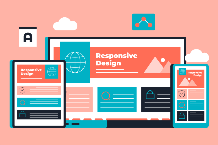
Responsive web design means building web pages that adapt their layout and content so they remain usable and readable on phones, tablets and desktop screens. In practice that means the same site can present as a single column on a phone and as multiple columns on a wide desktop, rather than maintaining separate mobile and desktop sites. The term was popularised by Ethan Marcotte in 2010 and rests on three practical ideas: fluid layouts, flexible images/media and media queries.
Think of a news site: on desktop you might see three columns of headlines and images; on a phone the site stacks those cards into a single column so headings remain large enough to read and images scale to fit the screen. That content-driven shift — not fixed device sizes — is what makes responsive design work across current and future screens. For more on how responsive design evolved and why it became standard practice, see the rise of responsive web design.
Why responsive design matters for freelancers and clients
Deciding whether you need responsive website design comes down to audience and goals. If people visit your site on different devices, a responsive approach gives a better user experience, avoids maintaining multiple codebases, and simplifies content updates. It also helps with discoverability because search engines prefer mobile-friendly experiences, and it’s typically easier to optimise one flexible site for performance than several device-specific versions.
For freelancers, responsive design is a selling point: you can scope projects around device priorities and performance targets rather than building separate mobile sites. For clients, prioritise mobile-first when analytics show a majority of visits come from phones; if visits are mixed, use a mobile-first build that scales up. Check your own analytics before deciding — device mix varies by sector and audience.
A short, actionable responsive-design checklist (for freelancers and clients)
Use this checklist to scope work, review proposals, or run QA on a responsive project. The items are outcome‑focused so non-technical clients can use them when talking to developers.
- Meta viewport: Ensure the
<meta name="viewport" content="width=device-width, initial-scale=1">tag is present so layouts scale correctly on mobile. - Design mobile-first: Start with a single-column mobile layout and add complexity as width increases; this helps prioritise essential content and reduce bloat.
- Flexible grids: Use CSS Grid or Flexbox and relative units (%, rem, vw) so containers and spacing scale with screen size.
- Responsive images: Provide appropriately sized images using srcset/picture or scaled assets and lazy-loading so devices download only what they need.
- Sensible breakpoints: Choose breakpoints tied to when content needs a new layout (not to specific device models).
- Test on real devices: Try major phone models, a tablet, and a desktop, and use browser dev tools to check intermediate widths.
- Performance and accessibility: Optimise critical resources, set performance budgets, and run basic accessibility checks (keyboard navigation, readable text sizes, colour contrast).
Practical example: start a prototype as a single-column mobile layout. When card stacks look too long, add a breakpoint where cards become two columns; add another breakpoint where three columns fit comfortably. Note: modern CSS (Flexbox/Grid and emerging container queries) often reduces the number of media queries you need.
Need help with one or two checklist items — for example, image optimisation or device testing? Consider using Swaplance to find short-term specialists who can handle performance tuning or cross-device QA without hiring a full-time team. Also, performance ties directly to search and user satisfaction; for technical details about speed and search impact see this overview on page speed and SEO.
Design handoff: planning responsive layouts in Figma (so devs can build them)
Good handoffs reduce rework. When preparing responsive files in Figma, focus on examples and rules developers can follow rather than dozens of fixed artboards.
- Auto Layout for components: Build repeating UI pieces (cards, lists) with Auto Layout so their behaviour as they grow/shrink is clear.
- Constraints and resizing: Set frame constraints that show how elements should pin or stretch when the parent container changes size.
- Provide a few widths: Share component or page examples at mobile, tablet and desktop widths and label the intent (e.g., ‘single column — stacked CTA’, ‘two-column content + sidebar’).
- Use components and tokens: Create reusable components and export spacing/typography tokens so developers can match values in CSS variables or design systems.
Practical example: create a responsive card component in Figma using Auto Layout that demonstrates single-column, two-column and three-column states; attach notes about minimum readable type size and how images should crop or scale. Figma’s Auto Layout and constraint system are standard features for responsive UI workflows and make the developer handoff much smoother.
When to hire a freelancer or agency — simple decision guide
Choose self-build or hire based on complexity, timeline and quality targets. Try DIY or a freelance template-based approach for small brochure sites with minimal integrations. Hire a freelancer or small agency when your project includes a large site, complex components, CMS or e-commerce integrations, strict performance or accessibility targets, or when you need thorough device testing across many models.
If you plan to hire, ask candidates for examples of responsive work, a basic testing plan (which devices/browsers they’ll check) and a performance budget. Swaplance connects you with vetted freelance designers and developers who specialise in responsive builds and cross‑device QA — a lower-overhead route than a full agency while still giving access to experienced specialists.
Practical example: if you need CMS integration, cross-device testing and performance tuning before launch, a freelancer with relevant case studies or a small agency will save time and reduce risk. For minor responsive fixes or performance tuning, a short-term specialist from a platform like Swaplance can plug the gap without a long contract.
Final thoughts: scope, test, and protect your investment
Responsive design is less about specific device widths and more about content behaviour: prioritise the user, design mobile-first, and test on real devices. Use the checklist to scope work and to evaluate proposals, and bring in specialists for performance and QA when you need a reliable outcome without adding permanent headcount.
Common questions
-
What's the difference between responsive and adaptive design, and which should I choose?Responsive design adapts layouts fluidly to any screen size; adaptive design detects certain screen sizes and serves fixed layouts for each. Choose responsive for broad compatibility and future-proofing; adaptive can work when you need finely tuned, device-specific experiences and tight performance control.
-
How long does it usually take to make an existing site responsive?Time varies by site size and complexity: a small brochure site can take a few days to a couple of weeks, while a complex CMS or e-commerce site with many templates and integrations may take several weeks or more. Ask freelancers for a phased plan so you can prioritise critical pages and measure progress.
-
Can I make a site responsive without rewriting the whole thing?Often you can improve responsiveness incrementally by adding the viewport meta tag, making key components flexible with relative units, and replacing fixed-width images with responsive assets. Large or legacy codebases may need deeper refactors, but staged work can deliver visible improvements quickly.
-
How do I test a responsive site to make sure it works on real devices?Start with a shortlist of representative devices (a small Android phone, an iPhone, a tablet and a desktop) and test critical user journeys on each. Supplement hands-on checks with browser developer tools, cross-browser testing services if budget allows, and a short bug list for the developer to fix before launch.