DeftPower
===== Project Goal =====
DeftPower is a white-label solution for companies that want to take EV drivers’ experience to a brand new level.
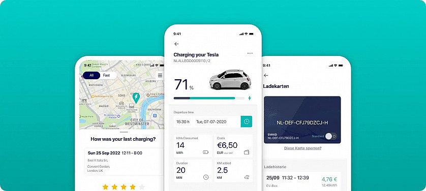
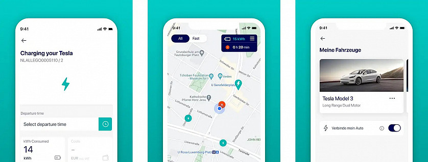
These days it’s not enough just to design & build a great electric car — users also expect to have a convenient way to interact with it. DeftPower provides this way by offering a white-label application for companies that want to enter the eMobility market. While companies get a stable and highly customizable solution to fit their business needs, end-users can enjoy a pixel-perfect app. It helps to manage the whole cycle: from the search for charging stations to the charging process itself & history management.
===== Challenge =====
White-label development is always a double challenge.
On the one hand, it’s necessary to build a solution that will match the needs of the customers, meaning it should be stable and customizable at the same time. When it comes to EV charging, the custom part isn’t limited just to different color schemes and logo placement. For DeftPower, we needed to add the ability to customize some more complex features like sign-up, the list of supported cars, etc.
On the other hand, we still cared a lot about the experience of end-users. Before we came in, the app had quite a poor UX, design, and performance, resulting in a 1.8 rating on app stores. Changing that was one of our key tasks, too.
===== Solution =====
DeftPower was an outstaff project, where we partnered with a client to provide dedicated IT resources to work on their specific project needs. This approach allowed the client to access a talented and skilled development team while having the flexibility to manage and control the project's budget and timeline.
Our 2 developers joined the client’s team to deliver cross-platform React Native applications for both iOS and Android.
The end result of the DeftPower project was a complete overhaul of the existing app, delivering a stable, customizable, and user-friendly solution for the client. We managed to leave enough room for customization and got positive feedback from the client’s customers on that matter.
The final product not only met the client’s needs for complex custom features but also improved the end-user experience by addressing the previous poor UX, design, and performance. As a result, the app store rating jumped from 1.8 to 4 stars.
We also paid special attention to animation on charging and history screens. It makes the information easier to understand and engage with, resulting in a more enjoyable user experience.


