CheckMyBus
====== Project goal ======
The CheckMyBus application entered an already existing market of bus ticket booking apps. Thus, it had to follow familiar behavioral patterns while offering something unique.
Moreover, they’ve already had an old application. Yet, it was buggy and had a 2-star rating.
From the UX perspective, it meant that users expected a similar experience to the one they’ve got by using other apps. Make it too different – and people are likely to switch back to more usual options.
At the same time, the CheckMyBus application had to go beyond it, giving users a solid reason to prefer it among all the competitors.
====== Solution ======
To build the CheckMyBus application we used the React Native framework. First, it allowed us to deliver a native experience across both iOS and Android platforms. Second, it helped to keep the development cost-efficient without any loss in speed or performance.
Our Team managed to introduce UX-patterns that are familiar to users while keeping consistency with the CheckMyBus website.
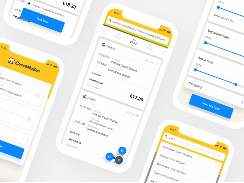
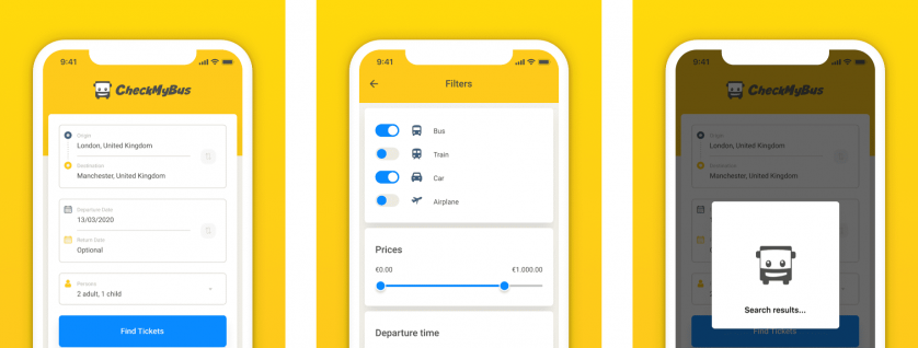
At the same time, we enriched mobile applications with a pixel-perfect UI design and animations. It includes custom date pickers, loading animations, booking screen, and others. Thus, they look fresh and catchy.
Moreover, the rating of the app jumped from 2 stars to 4.6!
Finally, we ensured smooth integration with BackEnd so users can directly access bus information right from carriers. This way users always get the most accurate info on prices, schedules, and stations.


